
Observations are done by tracking the source, while sampling and recording the
level of the radio continuum flux in regular intervals for
a sufficiently long duration. Displaying the data in a
waterfall plot of the phase diagrams
allows to spot more easily whether pulses are detected and how their intensity
varies in time.
Reduction of the Raw Data
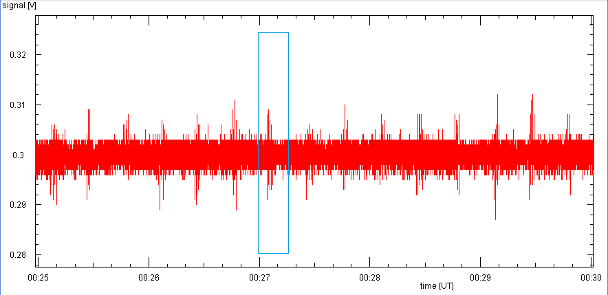
Let us take one of the first attempts, on 2 nov 2014 at UT 07:49, with B0329+54, the
brightest one in the northern skies:
.
|
|
|
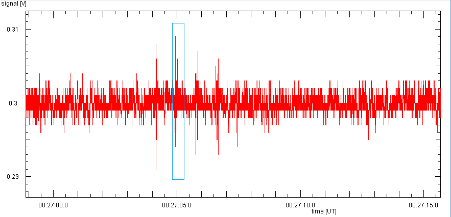
The raw data of a 58 min observation with 1 kHz sampling frequency show a lot of spikes, which are more or less periodic. | A five minute zoom shows bunches of sharp spikes every 30 s. |
|

|
Looking at one such bunch, it is composed of several very sharp spikes. All that is only local interference, much stronger than the signal from the pulsar! | Zooming in still further, another feature in the data can be seen: the signal level does not vary smoothly, but goes in steps of about 1 mV ... These are the steps of the 12 bit analog to digital converter in the Cebo stick, which has a resolution of 1/4096 = 0.00024 of the voltage range of 3.3 V, which makes 0.8 mV. |
The average level of the data is not zero, and often there is a slow variation of the mean level due to local noise. Therefore, application of high-pass filtering gives a data stream that is symmetric about the zero:
The high pass filter is realized as a simple processing of the data stream. If this comes as a sequence of pairs (time, value) one applies this procedure (written like BASIC)
average = 0.0
for i=2 to n
h = value(i) - average/tau
average = average + h*(time(i)-time(i-1))
value(i) = h
next
With a given time constant tau the filter removes any level variations
which occur more slowly than tau. The filter needs some time to settle,
so one should use only the outgoing values after a time of about 10*tau.
A First Look: FFT
|

|
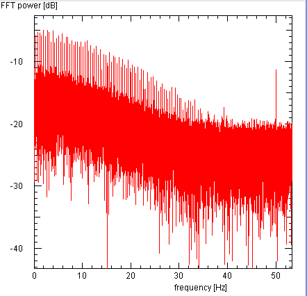
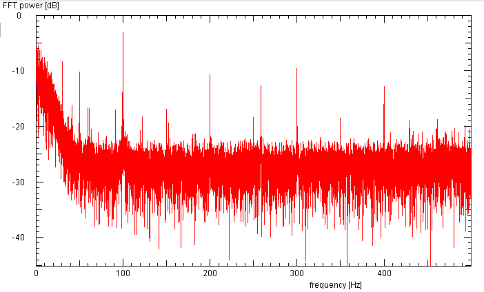
The spectrum of the raw data shows a noise floor which is constant for frequencies above 30 Hz, and rises to a value about 10 dB higher at zero frequency. On this floor one distinguishes a fence of narrow features ... | ... which are regularly spaced with an interval of 0.42 Hz. But this is NOT the pulsar, |
If one had guessed the correct period, the pulse will appear. Since the apparent period is the result of the modification of the true period due to the Earth rotation and the its movement around the Sun. this can be computed for time and position of the observer by the program TEMPO.
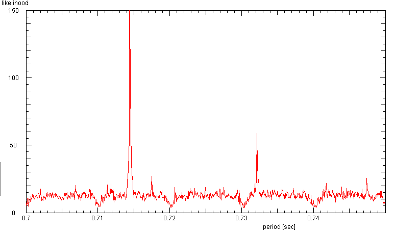
If one does not know the period (or pretends ignorance) one may determine the period by periodograms constructed for periods that are systematically scanned through a possible range. Since a periodic signal will result in a nice and low noise periodogram, one can use the low noise level as a measure of the likelihood for the presence of a periodic signal.
|
|
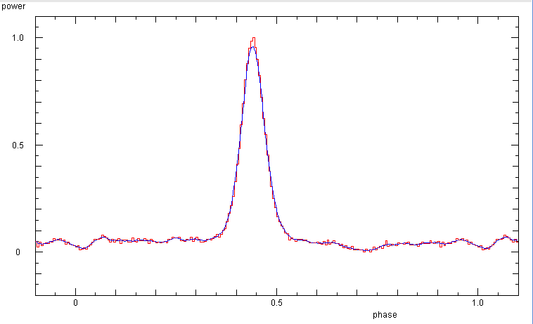
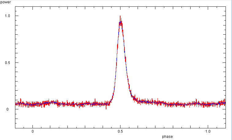
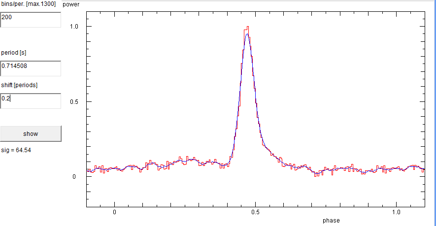
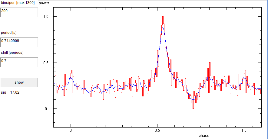
The phase diagram - with 200 bins and a period of 0.71449 s - of the pulsar B0329+54, obtained with the entire data shown above | If one scans thru the periods and uses the scatter in the resulting phase diagrams, one finds that the data contains a periodic signal with the period of the pulsar. Note the regular dips every 0.01 s due to the sampling at 1 kHz. The peak at 0.732s is one of many caused by plentiful local interference. |
In principle, the well-known periods of pulsars can be corrected for the Doppler shifts due to the motion of the observer on the rotating Earth, the Earth motion around the Sun, and the solar motion with respect to the pulsar in the Galaxy. But it is also quite easy to search manually or systematically for the period, by constructing phase diagrams for any given guess value for the period and looking for results which show a pattern with a minimum amount of noise. Hence one searches for a smooth average curve with the smallest amount of deviations.
|

|
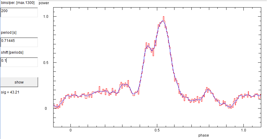
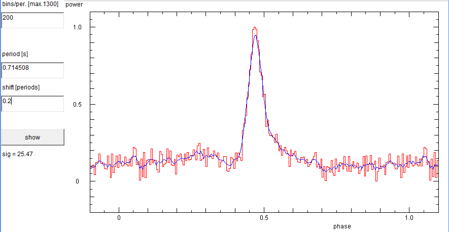
If we lower the period to 0.71445 s, the pulse starts to become disfigured. | Likewise, if we raise it to 0.7146 s. Thus, we detect the pulsar, as long as we get within 0.0001 s of the true period, in other words, if we get the 4th decimal place right. This is a rather narrow range, but it can still be explored by systematic searches! Longer datasets result in narrower ranges. |

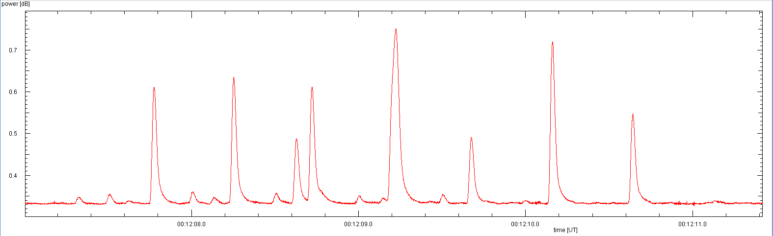
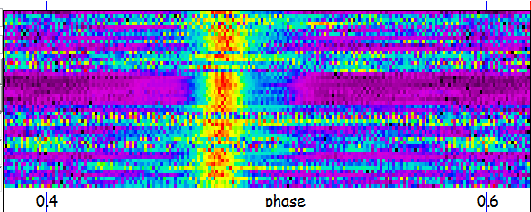
This is can be done for a complete data file, but it is also extremely helpful as a real-time display during an observation. If the assumed period is very close to the period of the pulses, one gets a vertical line in the display. Depending on the difference between assumed and true period, one gets still a straight line but which slopes to the left or right. Adjusting the period until the line is vertical allows to determine the true period.
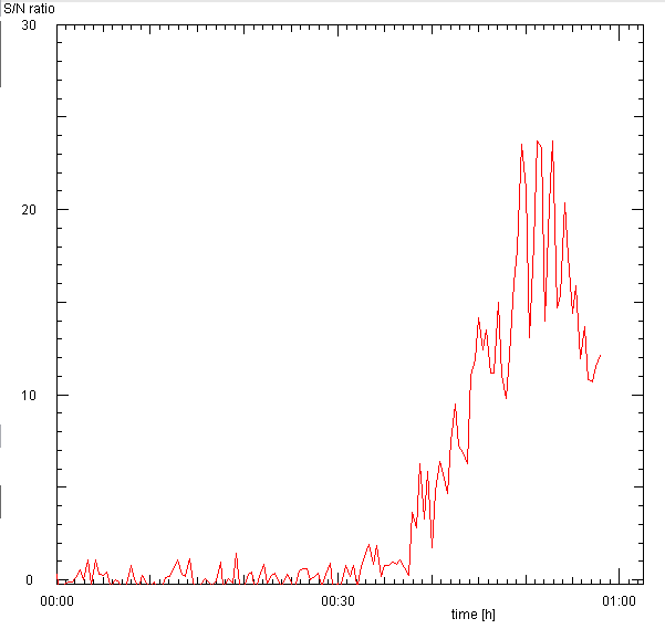
Since the strength of the pulse varies due to scintillation the real-time waterfall display allows to find out when the pulsar is strong during an observation run ...
The above waterfall of the 58 min observation on 2 nov 2014 shows that during the first 40 minutes the pulses were weak and for quite a while even completely buried in the noise. But for the last 10 minutes the pulse was very strong, far above the noise. The line of pulses slopes to the left, which means that the guessed period is too large.
However, one also notes that the pulse line has a kink, first sloping to the right, but then abruptly turning to the left. Note that the short bit of a line near the top also slopes to the right. Inspection of other data also shows this feature: the pulse line makes a regular zig-zag, changing between straight-line section every 15 minutes. This was a small problem with the triggering of the Cebo stick ...
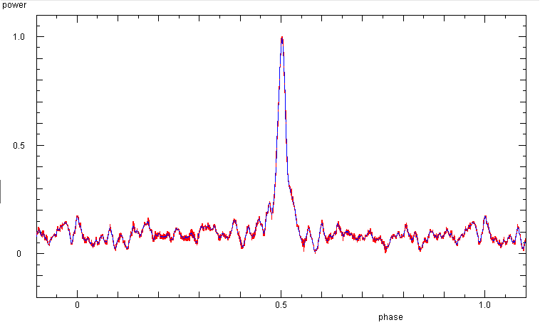
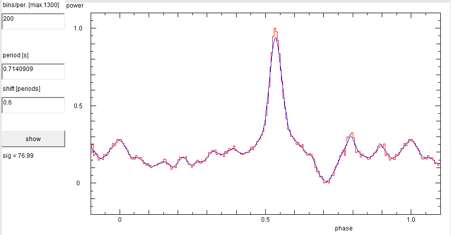
In the 2 nov data the S/N ratio improves only after about 40 minutes, then it reaches
as high as 25. If one makes a phase diagram from the data of the last 10 minutes,
one obtains a better pulse than from the entre noisy data set (as shown above):
The rise-time of the detector determines the ability of the measuring system
to resolve the pulse shape and e.g. reveal its finer details. Thus, we need
to measure the time constant of our system. Luckily, on 21 feb 2015 a series
of very stromg pulse-type signals are recorded, perhaps from a satellite.
As the individual signals appear to be rather narrow needle pulses, they may
serve to measure the response time of our detector system.
Signal to Noise Ratio
As the strength of the pulse can strongly vary, it would be good to have a quantitative
way to judge the signal strength. This can be done in a phase diagram by taking the ratio
of the maximum of the pulse and the standard deviation of the fluctuations in the
background around the pulse. If this is done for 60 second long packets of data, one
obtains a measure which allows the comparison of different data sets:
Considerations for Observation Planning
Response Time
|
|
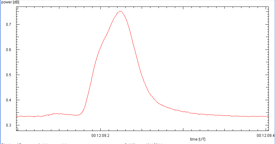
The entire series. | A single spike shows deformations reminiscent of a very sharp pulse distorted by the finite response time of the detector. From these data we estimate the rise and fall times of our system as about 1/20 s = 50 ms. |
These measurements were done with the 'old' instrumentation (HP437B power meter). Since the width of the pulse in B0239+54 is less than 10 percent of the period, hence 70 ms, the shape of the pulse will certainly be affected by the detector response time. Any fine structure within the pulse is washed out.
This is overcome by using the faster E4412A sensor and the EPM441A power meter, resulting in a much sharper pulse:
In a waterfall display with phase diagrams of 600 s duration, to improve the signal to noise ratio, of a 10 hour observation on 26 oct 2015 shows that the pulse is not symmetrical, but has a fainter subpulse trailing behind. This is seen as the blue or green region to the right of the main pulse:
Since the pulse strength fluctuates,
due to scintillation,
a longer observation may not yield such an improvement, as intervals
of strong signals are mixed with times when the pulses disappear
in the noise.
Detection of a pulsar thus depends also on whether one is lucky to
catch it when the pulses are strong. It may well be that a shorter
data set is still sufficient to detect an object:
Duration
In principle one should collect as many data as possible. In order to
double the signal to noise ratio, one needs four times as many data.
Similarly, detection or measurement of a source twice as faint as
another one, would require four times more data.
|
|
This is the phase diagram of the entire data - 25 min observation at 2 kHz sampling frequency, on 27 oct 2014. | If we use only every 10th datum of the original file - so that the sampling frequency is 200 Hz, we still get a clear pulse |
However, if we used only the first one tenth of the 1.6 million data points,
or only about 2.5 minutes, the pulse is no longer detectable. Thus, it is not only
important to have many data, but also that they cover a sufficiently long time
interval...
On 26 apr 2015, a 30 s long observation was done with a sampling rate of 20 kHz.
If we decimate the data, we can simulate the effects of lowering the sampling
frequency:
Choosing the Sampling Rate
A high sampling rate gives a high time resolution, so that details in the pulse
are easier to detect. But since the sampling frequency will not be a rational
multiple of the pulsar period, this is not an important issue, because sooner
or later every part of the period will be sampled. So the main advantage of a high
sampling rate is to give more data. This is good for the signal to noise ratio, but
it produces bigger data files, which are slower to transfer and to process.
To merely detect B0239+54 (with a period of 0.7 s and a pulse width of
about 50 ms) a sampling rate more than 100 Hz would be sufficient, as there would
be at least ten samples during a pulse.
|

|
|
The original file: with 20 kHz sampling frequency | decimated to 2 kHz, the pulse is still the same ... | and decimated to 200 Hz, the noise has increased a bit, but the pulse remains well defined. |
|
|
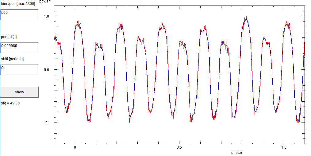
A phase diagram with 0.1 s period shows 10 clean sinusoidal waves. | A FFT spectrum reveals strong 100, 200, 300, and even 400 Hz components. A weaker 50 Hz component is also present. |
One is faced with making a choice between trading off time resolution and signal to noise ratio. This decision depends on how many data are available or possible, how much resolution one needs, and how much noise one may tolerate ...
|
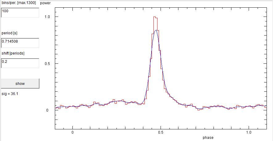
|
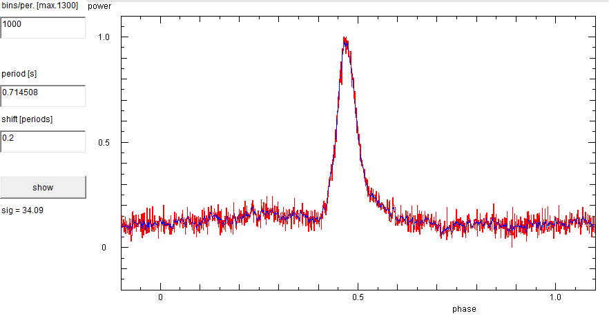
With 1000 bins the noise is stronger than with 200 bins (above), because the available signal power is divided among a larger number of smaller bins. | With only 100 bins, the noise fluctations are more strongly smoothed out. Despite the coarser binning, the pulse still remains very well defined! Any fine substructure would be washed out, but such details would not be recorded by the 'old' instrumentation anyway (see here). |